
In 1965, the German-born musician and graphic artist Klaus Voormann (b. 1938) received a phone call from John Lennon. Voormann had been a friend of The Beatles since their early Hamburg days, but the phone call still came as a surprise. “Do you have any ideas for a cover?” Lennon asked the illustrator. Voormann was taken off-guard. “I nearly said no” he recalled in an interview in 2006, “I hadn’t had a pen or pencil in my hand for years”.
Five years before Lennon’s phone call, Voormann had been living in Hamburg, and studying art at the city’s School of Design. One rainy night he got into a terrible argument with his then-girlfriend (the photographer Astrid Kirchherr) and ended up storming off into one of the city’s grittier parts. While walking through the dark streets, he stumbled upon a noisy club where live music blared from its cellar. Drawn in by the sounds, he suddenly forgot all about the argument and instead was enraptured by the music. On stage, The Beatles were honing their skills and stagecraft – to Voormann – it was a revelation. In that moment, his life catapulted in a whole new direction. It was to become a defining moment for the young artist – one that was to be filled with exciting new friendships, important artistic endeavours and a newfound love for rock and roll.

In the intervening years between Hamburg and the band’s invitation, Voormann had worked as a commercial artist in London – even living at one point with George Harrison and Ringo Starr. Eventually, he put illustration to one side and formed his own band, Paddy, Klaus & Gibson, which was managed by The Beatle’s manager Brian Epstein. Meanwhile, The Beatles themselves were in the thick of Beatlemania, attracting crowds of hysterical teens who were becoming increasingly harder to control. By 1966 the group were eager to change direction. That year they decided to quit touring, abandon their distinctive "Mop-Top" image and put more energy into redefining pop music by using the studio as a means to produce new and innovative sounds. Their new record, Revolver, brought pop to a whole other level, and the band were keen to do something special for its cover.
At the time, photographic album covers had become the norm. All six of the band’s previous albums had featured photography on the front, but, for this one, they wanted something more distinct. “We knew [Voormann] drew and he’d been involved in graphic design; I must admit we didn’t really know what he did, but he’d been to college,” said Paul McCartney in the 2000 Beatles’ book Anthology. “We knew he must be all right and so we said, ‘Why don’t you come up with something for the album cover?’

Before beginning work on the cover, Voorman went down to the studio to hear some of their tracks. The thirty-minute LP had taken the band more than three hundred hours of studio time to create – three times the amount allotted to their previous album Rubber Soul. It was an astronomical amount of recording for a record in 1966. Voormann later reflected on his first experience of hearing it: “They were being so avant-garde, I thought the cover has to do the same thing. How far can I go? How surreal and strange can it be? I wanted to push the design further than normal.”

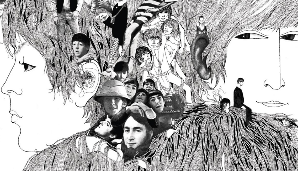
His decision was to try and reflect a similar avant-garde feel through his imagery. The resulting work was part photo collage and part Aubrey Beardsley-influenced ink drawing. The four members were drawn from memory with their hair swirling together to form a jungle of strands that enveloped the collaged elements. Rendered completely in black and white, it stood out strongly amid the popular coloured sleeves of the day.
Revolver was the first Beatles’ album that truly marked out the four distinct personalities of the group. Voormann’s illustration captures the band perfectly. Looking at it, you can see that the group is made up of four unique individuals, but they are also connected by kinship, a friendship and an affinity for one another. It is the perfect summation of the band’s relationship at that point in time.

Thankfully the four members loved the finished work. So too did their producer George Martin and manager Epstein. In fact, Epstein apparently cried tears of joy when he first saw it. The album took the band in a new and exciting direction, and Voormann’s illustration helped to bridge that changeover effortlessly. While the cover of Rubber Soul had hinted at a new psychedelic direction, Revolver fully embraced it. Its distinctive art was a vibrant explosion of trippy imagery that prepared listeners for the psychedelia that was held within. It chimed perfectly with the acid-influenced music that the band were creating. Voormann and The Beatles had brought psychedelia to the mainstream and, by the following year, the famed “Summer of Love” had arrived on a wave of sex, drugs and rock and roll.
The legacy of the Revolver artwork should not go underestimated. At a time when photography dominated album sleeves and record companies had in-house designers, Revolver stood out as an early example of a band choosing who they wanted to work with on their artwork. Their decision legitimised the album cover and turned a simple commodity into a fully credible art object. Since its release, many artists have followed suit with people like Robert Rauschenberg, Andy Warhol, Gerhard Richter and Jeff Koons all creating covers for musicians and bands.
The success of Revolver also encouraged The Beatles to continue to push the boundaries of what an album cover could be. Their next LP – Sgt. Pepper's Lonely Hearts Club Band – featured a cover design by Peter Blake (b. 1932) and Jann Howarth (b. 1942) that set another standard for what an album cover was. This cover was the first instance of a record being designed with an inner sleeve; and also the first record to contain printed lyrics.
As for Voormann, he continued to illustrate artwork for bands; creating covers for the likes of The Bee Gees and Wet Wet Wet, not to mention for friends like Ringo and Harrison. As a bassist, he played on albums for Ringo, Lennon and Harrison and even performed live with the John Lennon/Plastic Ono Band. From sixty-six till sixty-nine, he was the bassist for Manfred Mann, and he spent much of the seventies and eighties working as a music producer.

By the time the nineties arrived, Voormann found himself drawn back into the world of illustration. The Beatles had played a substantial role in his life, and to this day they have remained an endless source of inspiration for him. Hamburg Days (1999) was a book he collaborated on with Astrid Kirchherr (b. 1938) during the 90s. The book features photographs and illustrations based on their time together in Hamburg in the early sixties. He also worked with the graphic designer Stefan Gandl (b. 1969) on illustrations inspired by the songs of Revolver (above). At the time of writing this, he is set to release Revolver Reloaded (2016); an illustrated book celebrating the story behind the iconic cover (below).

Of all these projects from this period, his best-known work is undoubtedly his cover for The Beatles Anthology. Started in 1995, the Anthology was a hugely ambitious project that consisted of a documentary series (1995), a three-volume set of double albums (1995–1996), and a book (2000). It covered the entire history of the band – having to create an image that could encapsulate all of this was understandably a mammoth task. Fortunately, Voormann’s passion and knowledge of the group made him the perfect candidate to create a new iconic image.

Together with his friend and fellow illustrator Alfons Kiefer, they set about painting a massive photorealist scene that covered the band’s eight-year history together. (above). The beauty of the Anthology painting was that it also worked when split into three separate images — creating a unique cover for each Anthology album.

In the final cover, the one used for Anthology 3, there exists a tiny detail that I love. On the far right of the image (above), you can see a small part of Voormann’s original Revolver cover. Looking even closer at it, you can see a face staring out from the psychedelic mess of hair that sits below the drawing of Lennon. It is a self-portrait of the illustrator. This image also appeared on the original 1966 cover but, for this one, Voormann has aged by 30-years. Time has passed between both albums, and the illustrator has become a different person. Yet despite his changing, The Beatles have remained the same. We might change, but the music never will. Their image and their sound endure – they continue to be part of our culture – unaltered by time or circumstance. In many ways, The Beatles will remain immortal. As tributes go, Voormann's small gesture feels rather special.
Where next?
If you found this essay interesting ,you might also enjoy exploring these selections:
Heinz Edelmann & The Beatles
Two years after the release of Revolver, The Beatles headed to the silver screen in the animated musical Yellow Submarine. Directed by George Dunning, the film was art-directed by the great German illustrator Heinz Edelmann (1934–2009).
His Royal Master of Images to Their Majesties The Beatles: Alan Aldridge
In 1964 John Lennon gave the illustrator Alan Aldridge (b. 1943) the title of ‘His Royal Master of Images to Their Majesties The Beatles’. Five years later, Aldridge compiled a book called The Beatles Illustrated Lyrics. To this day, it is the only major collection of illustrated Beatles lyrics and a defining object in the history of the psychedelic era.
A Beatles-inspired graphic biography by Arne Bellstorf
If you're interested in the early Hamburg days of The Beatles then the graphic biography Baby's in Black (2011) is a definite 'must read'. Written and illustrated by Arne Bellstorf (b. 1979), it tells the true story of 'the fifth Beatle', Stuart Sutcliffe and the love of his life, Astrid Kirchherr. It's a beautiful and tender portrait of love that just happens to be set against a defining moment in Beatles history.