19 Dec 2016

A Subversive Bull: Robert Lawson and The Story of Ferdinand

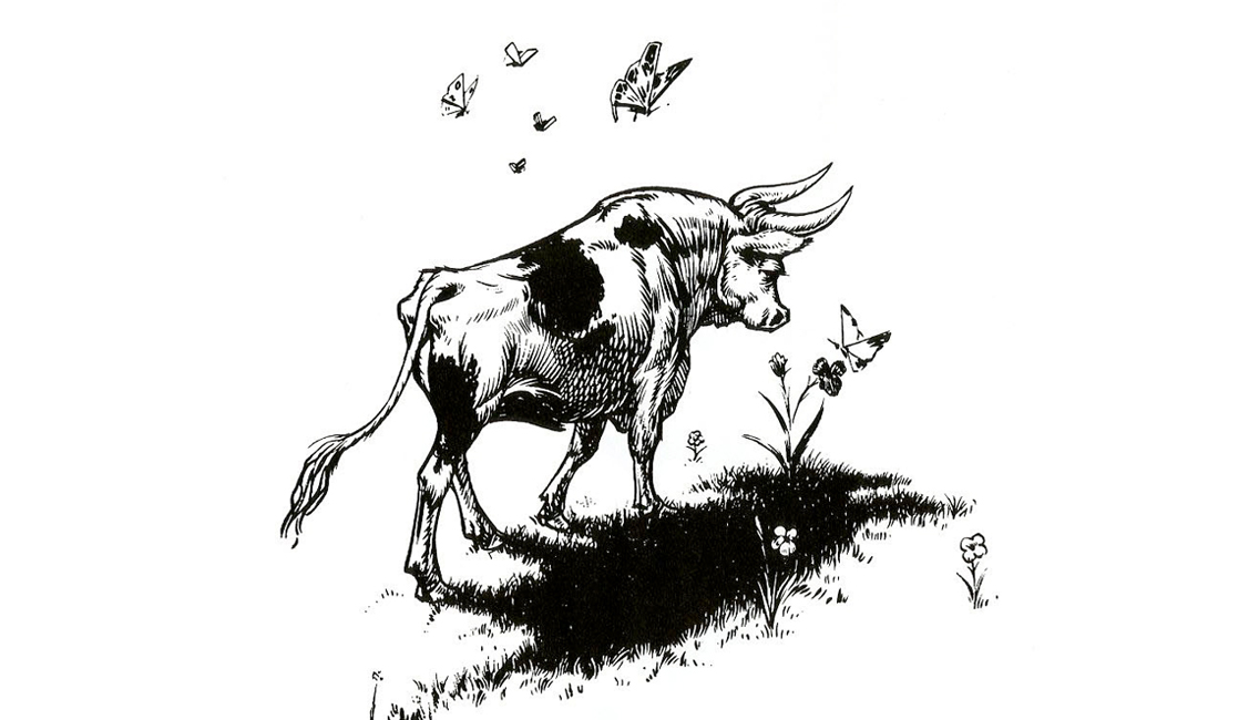
Fig. 01 — First published in 1936, The Story of Ferdinand was written by Munro Leaf and illustrated by Robert LawsonPhotograph: Illustration Chronicles; illustration © Robert Lawson

On a damp and rainy Sunday in October of 1935, Munro Leaf sat down to write a story. He had been eager to work with his friend – the illustrator Robert Lawson – for some time. And so he decided to pen a book which he felt might suit the illustrator’s skills. Lawson was a master at drawing animals, but horses, dogs, cats, rabbits and mice had all been done a thousand times already. Leaf wanted something new and decided that his story should be about a bull. What he created was called The Story of Ferdinand [01]. It was a simple but amusing tale of a peaceful Spanish bull who had no interest in bullfighting.

Leaf was himself rather modest about the work – remarking once that he had written it in less than forty minutes. Yet, once the words were combined with Lawson's beautiful black-and-white etchings [02], the pair felt quite satisfied with the outcome. Indeed, they even joked that their publication had the potential to go on to sell twenty-thousand copies. Two years later, the book had sold more than twelve times that amount.

What was even more surprising was the reaction that the simple story was getting. In no time at all, their picturebook was being labelled as subversive. Around the world, it was stirring up all kinds of international controversy. Banned in Spain and burnt by Hitler, The Story of Ferdinand remains, to this day, a fascinating example of the power of picturebooks.

Fig. 02 — 'Once upon a time in Spain there was a little bull and his name was Ferdinand' Photograph: Illustration Chronicles; illustration © Robert Lawson

Published by Viking Press in 1936, the release of Ferdinand came during the era of the Great Depression. For this reason, its initial release was rather modest. It seemed that their publisher was only mildly enthusiastic about it, and so only one-and-a-half-thousand copies were originally published. That year also saw the outbreak of the Spanish Civil War. In just nine short months after the book's release, Spain saw itself caught in a violent war between a right-wing group of Nationalists and the country's democratic, left-leaning government.

In light of these events, Ferdinand started to take on a much greater significance. Leaf and Lawson's book presented a Spanish character who stood out from society and refused to fight. Those who supported the violent uprising led by Francisco Franco – viewed it as pacifist propaganda and banned its publication. It wasn't until Franco's death in 1975 that this ban was eventually removed.

Fig. 03 — Above we can see Ferdinand's mother. She respects her son’s right to freedom of thought and believes he must establish his own sense of identity. We also see Ferdinand growing older while the spectre of death (shown as a vulture) looks down upon him'Photograph: Illustration Chronicles; illustration © Robert Lawson

Despite the tendency for people to read a political message in the story, Munro Leaf always maintained that its only agenda was to entertain. “It was propaganda all right,” he's quoted as saying, “but propaganda for laughter only.”

Even with all that said, people continued to draw their own meanings from the book. Clearly, Ferdinand is a story that celebrates the right for people to develop their own unique identities. Yet, to some, this message can be seen as dangerous when people don't conform to the mainstream. Or, for example, when they don't help to further a national agenda. Franco and his supports certainly saw it this way. So too did Hitler, who apparently labelled it as “degenerate democratic propaganda”. During World War II, he ordered that all copies be destroyed. After he was defeated in 1945, thirty-thousand new copies were quickly published and handed out freely to the children of Germany in the hopes of encouraging peace between nations.

Fig. 04 — 'What they wanted most of all was to be picked to fight at the bullfights in Madrid'; a picture of the other bulls Photograph: Illustration Chronicles; illustration © Robert Lawson

Even with the controversy that surrounded it, the book managed to become a massive international hit and a cultural phenomenon. In 1938 it outsold Margaret Mitchell's Gone with the Wind, and it went on to become the number one bestseller in the US that year. Today it has been translated into more than sixty languages and has sold millions of copies worldwide.

Ferdinand had – and continues to have – many famous admirers. People like H.G. Wells, Gandhi and Ernest Hemingway all supported the book – while musician Elliott Smith sported a tattoo of the peaceful bull upon his arm. One year, a giant Ferdinand floated down New York's Sixth Avenue as part of the Macy's Day Parade. On another occasion, the bull's story was turned into a song by jazz duo Slim & Slam. Even Disney got involved, creating an animated adaptation of the story in 1938.

Fig. 05 — Ferdinand sitting quietly under the cork tree and the five men in very funny hats Photograph: Illustration Chronicles; illustration © Robert Lawson

Much of its success must certainly lie in the fantastic pairing of Leaf's words with Lawson's illustrations. One account suggests that the illustrator loved the text so much that he managed to produce a complete "dummy" book on the same day he had read it. Another account suggests that the illustrator was initially intimidated by the text, saying that he had never drawn a bull before or even been to Spain. And so, for that reason, it may have taken him several months before he had researched enough to properly put pen to paper.

Whatever the truth may be, the book manages to transport its reader into Ferdinand's world effortlessly. The anatomy of the bulls are perfect, and the costumes of the picadors, matadors and banderilleros all feel accurate. Yet, these technicalities go unnoticed. What stands out is the beautiful interplay between the words and pictures. Ferdinand is a warm, good-natured and humorous book. It is filled with inventive flourishes and a sharp rhythm that allows the text and image to carry equal importance.

Fig. 06 — A detail from the book showing two Banderilleros who have now become afraid of Ferdinand. They call him 'Ferdinand the Fierce' Photograph: Illustration Chronicles; illustration © Robert Lawson

A philosophical reader will certainly draw political themes out from this story – but many will argue that its true longevity has nothing to do with the possible metaphors within it. A young audience isn't drawn to The Story of Ferdinand because of its political parallels. They like the book simply because Ferdinand is an easy character to empathise with.

Another strength of this work comes from the fact that Leaf and Lawson don't patronise their young readers. “I have never, as far as I can remember, given one moment's thought as to whether any drawing that I was doing was for adults or children” Lawson once said. "I have never changed one conception or line or detail to suit the supposed age of the reader.” Perhaps this is the main reason for the book's survival.

Fig. 07 — 'Ferdinand ran to the middle of the ring and everyone shouted and clapped because they thought he was going to fight fiercely and butt and snort and stick his horns around'Photograph: Illustration Chronicles; illustration © Robert Lawson

Lawson felt that the terms "children’s author" and "children’s illustrator" were condescending. He believed that these titles suggested that an author or illustrator had to cater their work to fit the limited tastes or understandings of young readers. He believed that the opposite was the case. He felt that children were less limited than adults.

“They do not know that they ought to admire certain art because it is ‘naive’ or ‘spontaneous’ or because it has been drawn with a kitchen spoon or a discarded shirt front,” he said. “They are, for a pitifully few short years, honest and sincere, clear-eyed and open-minded. To give them anything less than the utmost that we possess of frankness, honesty and sincerity is, to my mind, the lowest possible crime.”

Fig. 08 — The final page of the book shows Ferdinand after he has returned from the bullrings of Madrid. He sits peacefully on his hillPhotograph: Illustration Chronicles; illustration © Robert Lawson

Over the course of their careers, Leaf and Lawson worked together on one other title. It was a book set in Scotland called Wee Gillis (1939). It received great acclaim and was cited as a 1939 Caldecott Honor Book. In his lifetime, Leaf wrote nearly forty titles and had a career that spanned forty years. Lawson also had a long and successful life as both an illustrator and author. In 1945, he became the first – and so far only – person to be given both the Caldecott Medal (They Were Strong and Good, 1941) and the Newbery Medal (Rabbit Hill, 1945).

Yet it is their tale of Ferdinand that they will continue to be both best remembered for. More than three-quarters of a century on, its message continues to resonate, and Ferdinand's story is one that remains shared, loved and celebrated all over the world.


You can find links to borrow or purchase The Story of Ferdinand here.


If you found this essay interesting, you might also enjoy exploring these selections:

Shel Silverstein's 'The Giving Tree' (1964)
Similarly to The Story of Ferdinand, Silverstein'sThe Giving Tree faced controversy. Even to this day, people continue to argue over whether or not the book is divisive. Its ability to be open to interpretation makes it a fantastic book to discuss and have conversations about with young readers.

Jerry Pinkney's 'The Lion & The Mouse' (1999)
Humans have possibly been using animal society as an analogue for our own society for as long as we've had stories. Aesop’s Fables had been first collected in around 600BCE, and they still continue to entertain. Pinkney's wordless adaptation of The Lion & The Mouse is a particularly fine example of the timelessness of these tales.

Keith Negley's 'Tough Guys [Have Feelings Too]' (2015)
This book by Keith Negley expands on Leaf's idea that somebody's physicality shouldn't be what defines them. Tough Guys (Have Feelings Too) is fun and playful. It explores clichéd images of masculinity sensitively and entertainingly, encouraging readers to think about what emotions are and why they're important.


Related Essays

12 Jul 2016

Alex Steinweiss and the World’s First Record Cover

Fig. 01Smash Song Hits (1940), songs by Rodgers & Hart, Columbia Records. Widely regarded as the first commercially illustrated record album cover, designed by Alex Steinweiss after a staged photograph of New York's Imperial Theatre marquee. Source: Internet Archive: Great 78 Project

In 1939, a twenty-three-year-old Alex Steinweiss (1917–2011) was working at Columbia Records when inspiration struck. He quickly grabbed a photographer, and the pair headed down to New York's West 45th Street and stood outside the city's famous Imperial Theatre. Looking up at the building's distinctive marquee, they both agreed — it was perfect!

The young Steinweiss had only just landed a job at Columbia Records, where he worked as the label's first art director. CBS had recently opened a new headquarters in Bridgeport, Connecticut, and their advertising manager was eager to hire someone to design promotional displays and advertisements for the label. It was a dream job, but Steinweiss already had greater things in mind.

At the Imperial Theatre, Steinweiss convinced the owner to briefly change the signage of the marquee. As evening arrived, they swapped out the letters and then lit them up: 'Smash Song Hits by Rodgers & Hart', it proudly announced. The photographer snapped a picture and, in doing so, he captured a little bit of history. The resulting design [01] became the world's first commercially illustrated record album cover, establishing a model that would soon be adopted throughout the recording industry.

Fig. 02Gene Autry Cowboy Songs (1940) by Gene Autry, OKeh Records. This compilation was made between 1933 and 1937 and issued following CBS's revival of the OKeh label after the retirement of the Vocalion imprint. Designed by Steinweiss, the cover demonstrates how illustrated packaging was applied to established catalogues, helping to redefine the marketing of existing genres like country and hillbilly. Source: Smithsonian, CC0 1.0

These days, we tend to take album artwork for granted, yet before Steinweiss, the record industry really didn't have much of a graphic tradition. When the 78 RPM emerged during the 1910s, they were all sold separately. Each record would last just three to five minutes, and each one was typically packaged in dull paper or cardboard sleeves that either had the name of the producer on it or the name of the retailer who was selling it.

Fig. 03Cante Flamenco (1941) by La Niña de los Peines, Columbia Records. One of Columbia's early illustrated album releases shows how Steinweiss's approach extended beyond popular music to international repertoire. Source: Smithsonian, Gift of Asbeth Lee and Jack M. Eichner, CC0 1.0

By the 1920s, record labels began to offer special 'record albums'. These were dark-coloured books with leatherette bindings and empty sleeves (quite similar to photo albums). A record album would offer more protection for a collector's records and allow for them to build a personal record collection. By the 1930s, some record companies were expanding on the album idea by issuing specially pre-assembled albums. These albums could include recordings from a particular artist, a genre, a suite of classical music, or even a hits compilation. Despite this novel idea, all of these collections generally looked the same and offered very few visual clues to help consumers tell each one apart.

Fig. 04Hot Jazz Classics (1941) by Teddy Wilson & Billie Holiday, Columbia Records. This early jazz compilation shows Columbia's growing use of modern graphic design techniques.Source: Smithsonian, Gift of Lucy C. Shain in memory of James Lewis Shain, CC0 1.0

“To my mind, this was no way to package beautiful music,” Steinweiss remarked in the fantastic book Steinweiss: The Inventor of the Modern Album Cover. For him, these indistinguishable covers had to change. Eager to do something about it, he walked into management and insisted that they adopt a new way to sell records. Initially, Columbia was reluctant to get on board (a $2,500 investment for Steinweiss' idea was certainly a lot to ask for) yet, when they did eventually give in, record sales increased by almost nine-hundred percent, and the idea was quickly heralded as an indisputable success.

Fig. 05Blues By Basie (1944) by Count Basie and His All-American Rhythm Section, Columbia Records. Steinweiss flourished in genres like blues and jazz. His bold type and expressive illustrations brought a distinctive style to the swing era. Source: Smithsonian, Gift of Lucy C. Shain in memory of James Lewis Shain, CC0 1.0
Fig. 06Horace Heidt presents: At the Piano...Frankie Carle (1946) by Frankie Carle, Columbia Records. By the mid-1940s Steinweiss had refined a visual language of type, colour and illustration that became synonymous with Columbia Records.Source: Smithsonian, Gift of Asbeth Lee & Jack M. Eichner, CC0 1.0

Throughout the forties, Steinweiss’ work dominated the world of music. Records, that had typically been sold at the back of appliance stores, had become desirable objects that could capture the imagination (and wallets) of music lovers everywhere. From jazz bands to show tunes and from classical works to pop acts, Steinweiss – quite literally – covered them all. “I love music so much," he said in the 2009 book, "and I had such ambition that I was willing to go way beyond what the hell they paid me for. I wanted people to look at the artwork and hear the music.”

For Steinweiss, album artwork offered the complete package. He approached each and every album like a small canvas. For him, they were opportunities for experimentation and, every day he'd play with layout, illustration, colour, typography and hand-lettering. His real talent lay in his ability to combine all these unique elements effortlessly and fluidly. With a Steinweiss cover, you were nearly always guaranteed to see modern elegant type, rich and vibrant colours and beautiful lively illustration.

Sometimes his work could be highly symbolic or conceptual — such as his striking illustration for Paul Robeson's 1942 Songs of Free Men. At other times, Steinweiss could be lighthearted and whimsical; Gene Autry Cowboy Songs [02] demonstrates this particularly well. No matter the record, its content was always the starting point and, as a music fan, that made his life a joy.

Fig. 07Songs Of The Saddle (1949) by Bob Atcher, Columbia Records. Published shortly after the introduction of the long-playing (LP) record in 1948, the album demonstrates the continued influence of Steinweiss's illustrated album format during a period of technological change. Source: Smithsonian, CC0 1.0

From 1938 until 1973 Steinweiss worked actively in record cover design. Following his run at Columbia, he went on to design packages for London, Decca and Everest Records. During the course of his career, he produced nearly two-and-a-half thousand covers and created nearly every one of them by hand.

Following the forties and fifties, modernism eventually gave way to psychedelia, and the emerging youth culture of the sixties quickly became the prime market for the cash savvy record executives. While these album covers feel distinctly removed from the work of Steinweiss (one such example will be our focus next time), they do owe an incredible debt of gratitude to Steinweiss's legacy.

While Steinweiss may have given us the very first album cover – in many ways – his legacy is even greater than this. Steinweiss left us with the blueprint for what an album cover is and what it can be. As legacies go, that ain't too bad!


If you found this essay interesting, you might also enjoy exploring these selections:

Jim Flora's lively jazz covers of the 40s and 50s
In 1942 Steinweiss recruited Jim Flora (1914–1998) to handle the jazz covers at Columbia. Flora was a huge jazz fan, and his comical and idiosyncratic illustrations brought vigour and energy to the music of the era.

The graphic modernism of Saul Bass' album covers
Best known for designing some of the most iconic title sequences in the history of cinema, Saul Bass (1920–1996) also created a number of album covers. Alongside artwork for film soundtracks, Bass also created covers for jazz records, musicals and even a record of tone poems conducted by Frank Sinatra.

The modern-art influenced jazz covers of Neil Fujita
A talented book and record cover designer, Columbia hired Neil Fujita (1921–2010) in 1954 to build on the work of Steinweiss. During this time he created iconic work including covers such as Miles Davis' 'Round About Midnight (1959), Dave Brubeck's Time Out (1959) and Charles Mingus' Mingus Ah Um (1959).


Related Essays

Tracing a history of illustration through the pictures, people and moments that shaped how we see the world.

© Illustration Chronicles 2016–2026